Massive improvements to networking and UI
I'm skipping a version number because of how substantial this update is. It includes significant improvements in networking, UI, art, and more.
Networking Efficiency and a Powerful Foe
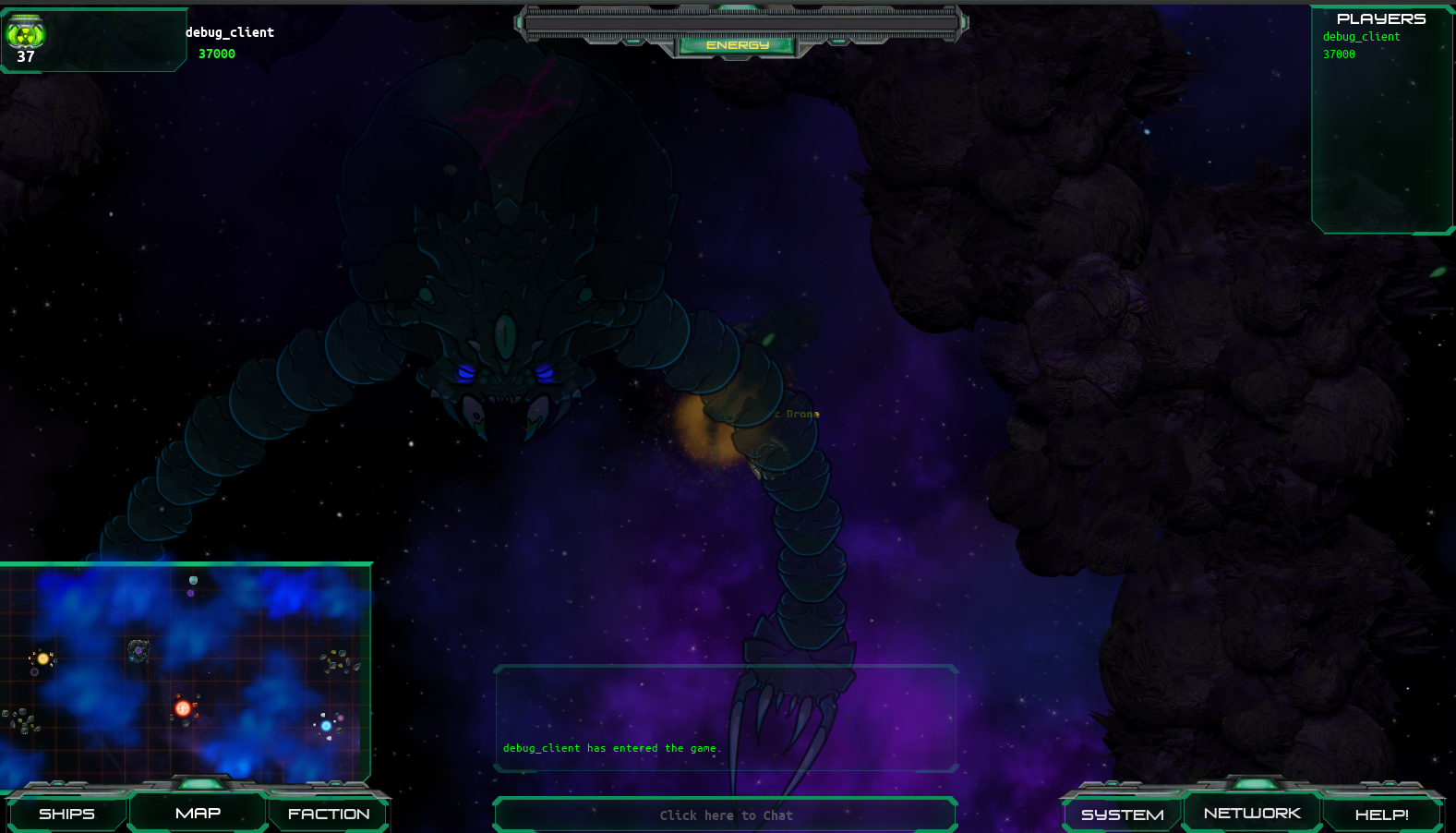
A major feature is a new concept for how to network bots and players within the Godot multiplayer API. The initial version of this showcases a hivemind boss enemy who can summon and coordinate many minions to thwart the player and also talk. This isn't just new enemies, but a vastly improved model for AI ships in general and a new model for networking objects in Godot that should increase the efficiency of running bots both in terms of CPU and network traffic. The previous model was tested up to 60 bots and 2 players, but could overwhelm the server since each bot and each player were in constant communication. I have not stress tested this but it should allow for an order of magnitude increase in how many players/bots can interact without lag. It also opens the door for 30 or more players to each construct and control a fleet (10+) ships in real time battle. I've not tested the limits of this yet, and need your help to do so :)

The hivemind also features a new audio component that I've written within Godot's spacial audio system which allows the AI to communicate with players in a way that combines context with randomness in a way that should have variety and may legitimately be scary. This has a lot of room for future growth, let me know what you think.
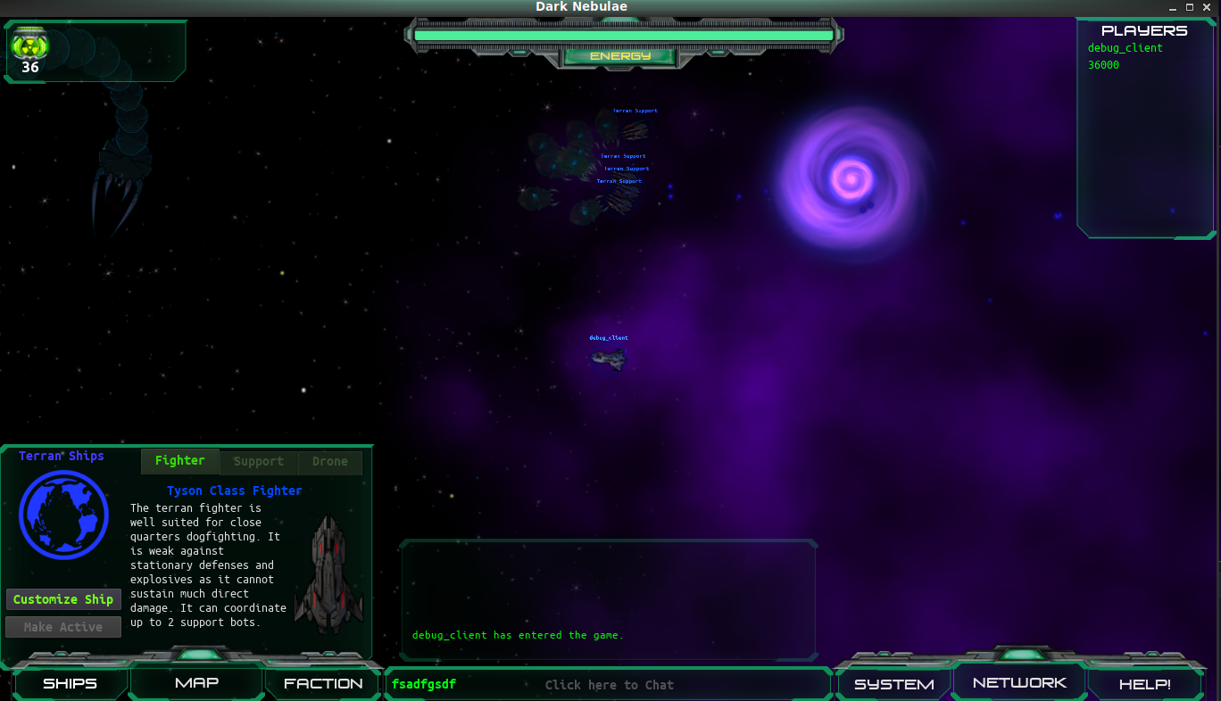
The most obvious change is that the UI has been completely overhauled with a consistent theme and graphics. Previously the UI used the standard Godot UI widgets and theme. This was functional, but not thematic. I've learned about a fun thing called nine-patch or 9slice which is a simple way to make fancy gui frames that can scale without getting warped weirdly. You can learn about this a bit here if it somehow sounds interesting, or if like me you have always been kind of baffled by GUI design. The two screenshots below show the new UI and the old so you can see the difference. I think it should be an improvement across the board though it touched tons of things and some bugs may remain. Any feedback on this is most welcome!

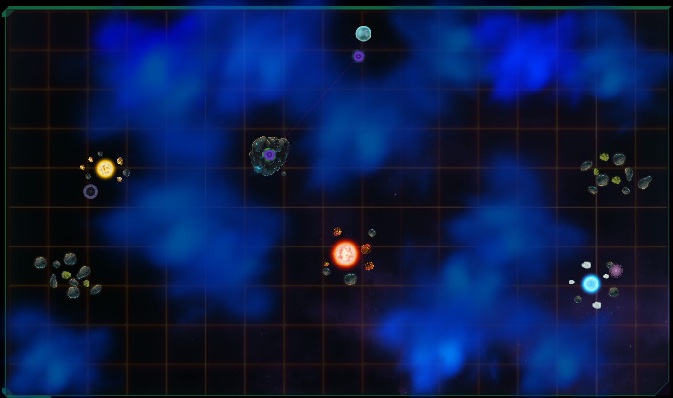
With the increased networking model. I've been considering many ways to thoughtfully expand the scope of the play while retaining the fast-paced one-on-one tactical combat. To this end I've explored many concepts in maps and territory/influence maps to help me decide how to design the larger universe/starmap and have been working on a post dedicated to this exploration of maps and how the shape our perceptions of space in the real world and in games. The new UI features my first small scale map which may end up being an instanced "homeworld" for the player to learn the game before diving into bare-knuckled multiplayer RTS/4X/tactical combat.

Files
Get Dark Nebulae Online
Dark Nebulae Online
A multiplayer top-down strategic space combat game.
| Status | In development |
| Publisher | |
| Author | alshady |
| Genre | Strategy |
| Tags | 2D, Godot, Multiplayer, Real time strategy, Space, Space Sim, Top down shooter |
| Languages | English |
More posts
- Godot texture interaction tipsAug 27, 2018
- Why Godot game engine is awesome - Part 1Jul 22, 2018
- Dark Nebulae 2.3.0 Alpha ReleaseJun 03, 2018
- Community forum, new ships, new audio systemApr 20, 2018
- Dark Nebulae Online Alpha Update and TrailerApr 15, 2018
- Dark Nebulae 1.3 - UI ExplorationMar 18, 2018
- Dark Nebulae 1.2 UpdateMar 10, 2018
- Dark Nebulae Alpha Has Begun!Mar 04, 2018
- Zoom to minimapMar 02, 2018

Comments
Log in with itch.io to leave a comment.
You should use https://semver.org instead of clown-town versioning.