Dark Nebulae 1.3 - UI Exploration
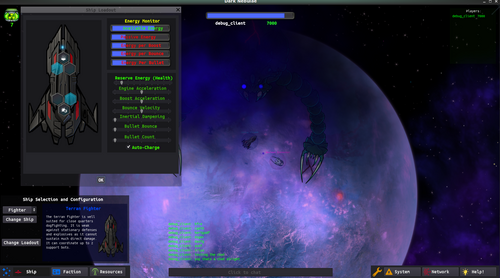
This week's update features a ton of UI improvements to get ready for additional ship classes, a larger map, ship upgrades, mothership upgrades, resource collection, playable Zarkavan faction, and more. Additional and improved sound effects, additional and improved station/ship art, and I've finally added stars.
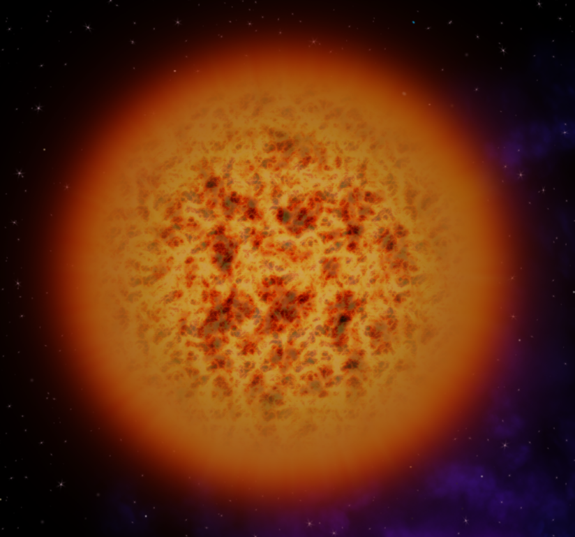
Stars!
This hadn't been a priority before, since you are deep inside a nebula, but now that I'm building out a larger map and want to create territories, having some stars in close proximity to the stellar nursery seems like a good idea.
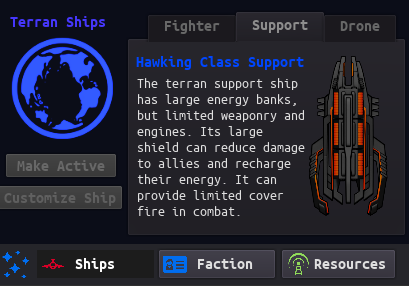
Per-faction ship menus:
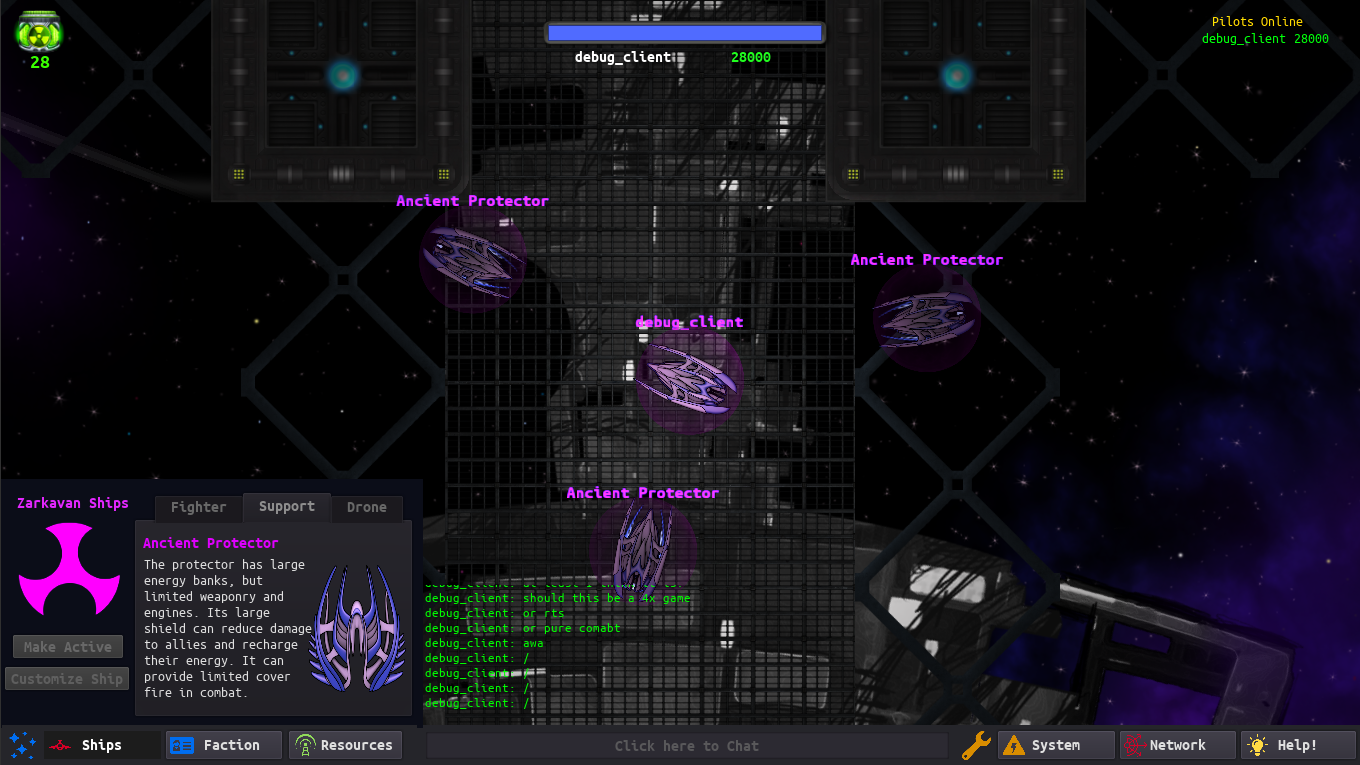
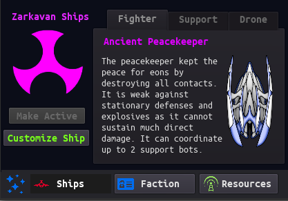
There is a new ship menu on the UI bar which has information on every ship for each faction. This is also how you access the new ship upgrade popup menu. You can only view ships that are in your current faction. This is in preparation for different ship classes.
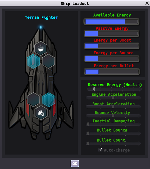
Ship Customization Menu:
This is a prototype for a ship upgrade menu which is currently non-functional. I want to get some feedback on how complex/intuitive the new UI is before investing in getting it all working. For now I want to be able to tweak ship variables manually via a slider, though each change will have some impact on energy usage and availability. Install-able upgrades in ships may complement or replace this system later.
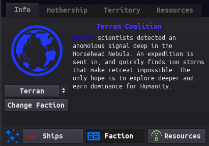
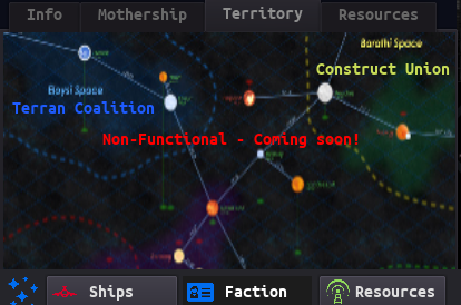
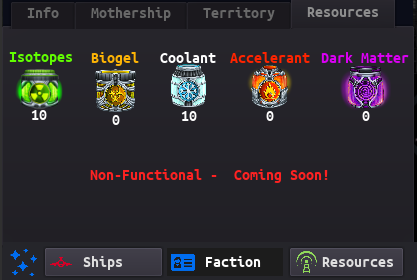
Faction Information Menu:
All 3 factions have a set of info screens. I'm currently planning to implement some type of mothership upgrade system, territory capture, and resource collection that is faction-wide. I'm not sure how to make the shared upgrade / resource system scale to persistent maps. Maybe server resets or mothership permadeath.
Chat:
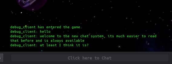
I completely rewrote how in-game chat works. Now you can always see the chat and access it from the middle of the UI bar instead of having to click a tab, and when you are typing, the chat history gets bigger and a scroll wheel appears. I struggled to get the Enter button to open the chat, but due to some idiosyncrasies in how Godot handles GUI/vs normal input, I didn't get this working yet. The list of online players and score is also permanently displayed in the upper right hand corner instead of a dedicated window. Overall it should be much easier to communicate with other players.
Camera Zoom:
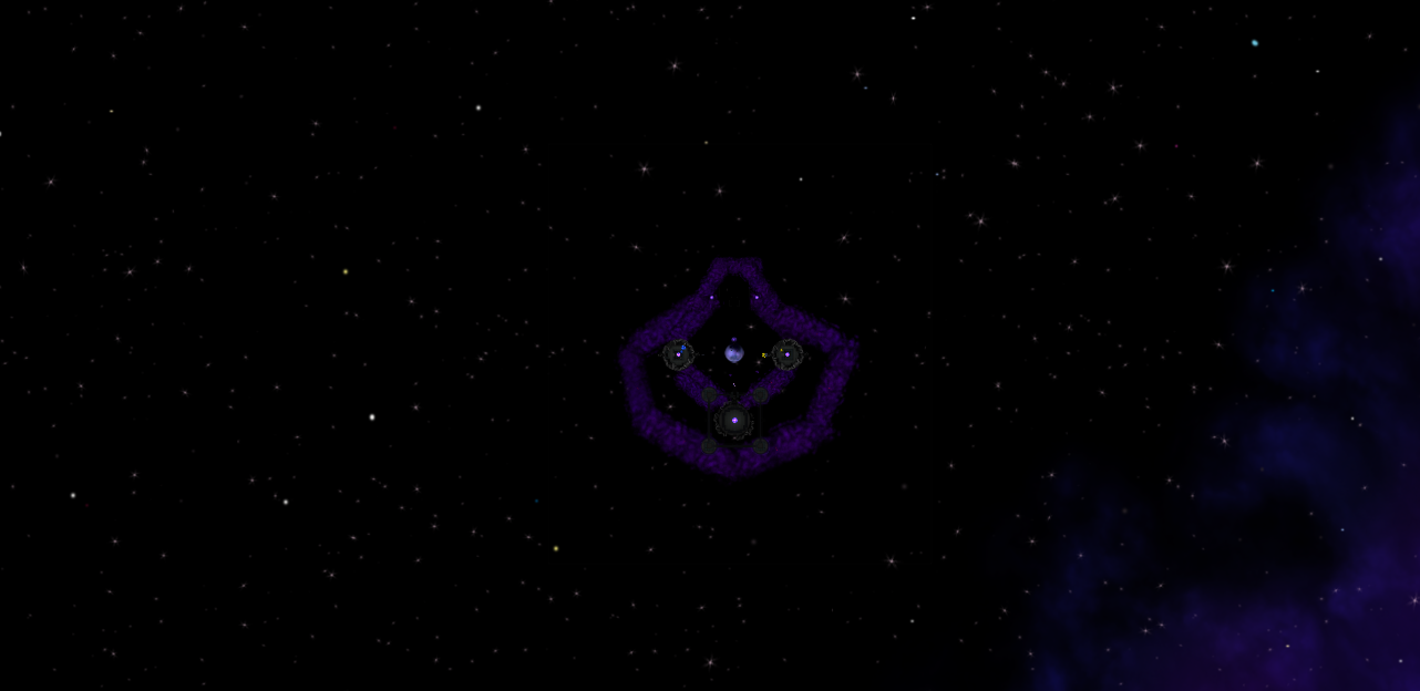
I've significantly increased camera zoom levels in anticipation of larger map sizes. It runs fine for me but I'm curious if other folks have performance issues with this. If not, I will make it so you can zoom out to a large scale mini-map with an icon overlay.
Audio:
- Spacial audio effects. Now you can hear other ships firing weapons, ship explosions, impacts and more. The volume decreases as you get further away. Music should no longer have a spacial dependence.
Files
Get Dark Nebulae Online
Dark Nebulae Online
A multiplayer top-down strategic space combat game.
| Status | In development |
| Publisher | |
| Author | alshady |
| Genre | Strategy |
| Tags | 2D, Godot, Multiplayer, Real time strategy, Space, Space Sim, Top down shooter |
| Languages | English |
More posts
- Godot texture interaction tipsAug 27, 2018
- Why Godot game engine is awesome - Part 1Jul 22, 2018
- Dark Nebulae 2.3.0 Alpha ReleaseJun 03, 2018
- Community forum, new ships, new audio systemApr 20, 2018
- Dark Nebulae Online Alpha Update and TrailerApr 15, 2018
- Massive improvements to networking and UIApr 01, 2018
- Dark Nebulae 1.2 UpdateMar 10, 2018
- Dark Nebulae Alpha Has Begun!Mar 04, 2018
- Zoom to minimapMar 02, 2018

Leave a comment
Log in with itch.io to leave a comment.